There are situations when all you want is just to have 2 Y-axes on your chart, mainly because of the different nature of the information on the screen. Like for example full figures like revenue or quantity sold and ratios like the average number of items per order or a percentage of something. So you end up having in the same chart big numbers (thousands or millions) and small numbers (between 0 and 100 when percentages or even less for normal ratios).
The only out of the box chart in OBIEE covering this kind of need is the Line-Bar, the only one allowing you to have 2 independent vertical axes.
Let’s look at an example…
(done on OBIEE 12.2.1.1.0 SampleApp v607)
The out of the box Line-Bar chart
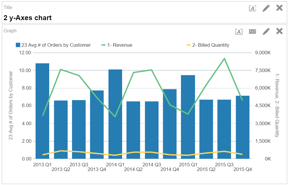
Out of the box Bar-Line chart in OBIEE 12.2.1.1.0
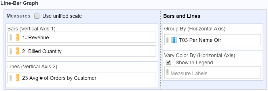
Your business users ask you a chart showing Revenue, Billed Quantity and Average number of orders by quarter. Nothing complicated, all these measures exists in your subject area, select them in few click and select the Line-Bar chart. Last thing is to set Revenue and Billed Quantity as lines and Average number of order as bars to have the “big numbers” on one axis, and the average (small numbers) on the other one. Done!
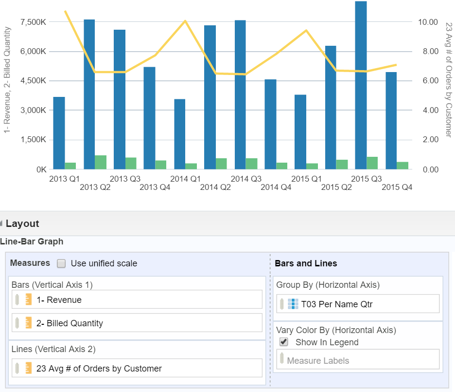
To swap axes we can exchange the measures in the view editor
The result is not too bad, but … Would be better to have the Revenue and Billed Quantity on the left Y-axis as it’s the measures we are the most interested in. How to swap axes?
The simplest solution is to exchange measures in the view editor. The problem is that now the Revenue and Billed Quantity is a bar and the Average number of orders a line. That’s not what the business users want, they ask for lines related with the left Y-axis and bars related to the right Y-axis…
Change the type between bars and lines
Officially there isn’t any control in the GUI to decide if you want a bar or line for the left or right axis, but there is a way to do. Time to look under the hood, explore the XML representing the analysis in the Advanced tab.
|
1 2 3 4 5 6 7 8 9 10 11 12 13 14 15 16 17 18 19 20 21 22 23 24 25 26 27 28 29 30 31 32 33 34 35 36 |
<saw:view xsi:type="saw:dvtchart" name="dvtchart!1"> <saw:display type="lineBar" subtype="basic" renderFormat="default" mode="online"> <saw:style barStyle="default" lineStyle="default" scatterStyle="default" fillStyle="default" bubblePercentSize="100" effect="2d"/> </saw:display> <saw:canvasFormat height="330" width="640"> <saw:dataLabels display="default" label="default" position="below" transparentBackground="true" valueAs="default"/> <saw:title mode="custom"/> </saw:canvasFormat> <saw:selections> <saw:categories> <saw:category> <saw:columnRef columnID="c9846f8f6c2216044"/> </saw:category> </saw:categories> <saw:measures showMeasureLabelsOnCategory="false"> <saw:column measureType="y2" riserType="line"> <saw:columnRef columnID="c6605f8f5332d11d7"/> </saw:column> <saw:column measureType="y1" riserType="bar"> <saw:columnRef columnID="c6ffb5a382e2c0a49"/> </saw:column> <saw:column measureType="y1" riserType="bar"> <saw:columnRef columnID="c89bc1c041c9af80c"/> </saw:column> </saw:measures> <saw:seriesGenerators> <saw:measureLabels/> </saw:seriesGenerators> </saw:selections> <saw:legendFormat position="top" transparentFill="true"/> <saw:axesFormats> <saw:axisFormat axis="X"> <saw:title mode="custom"/> </saw:axisFormat> </saw:axesFormats> </saw:view> |
The interesting part is at line 15 of the code above, representing the Line-Bar visualization: inside the saw:measures tag there is the definition of the measures in the chart, they link a criteria column with left or right axis and the kind of visualisation between line and bar.
So having the Revenue and Billed Quantity as lines related to the left Y-axis and the Average number of orders a bar linked to the right Y-axis is as simple as this:
|
1 2 3 4 5 6 7 8 9 10 11 |
<saw:measures showMeasureLabelsOnCategory="false"> <saw:column measureType="y2" riserType="bar"> <saw:columnRef columnID="c6605f8f5332d11d7"/> </saw:column> <saw:column measureType="y1" riserType="line"> <saw:columnRef columnID="c6ffb5a382e2c0a49"/> </saw:column> <saw:column measureType="y1" riserType="line"> <saw:columnRef columnID="c89bc1c041c9af80c"/> </saw:column> </saw:measures> |
By changing the riserType attribute by hand in the XML we can change the visualisation for each measure between line and bar. The measureType attribute define to which Y-axis the measure is related.
The XSD clearly define all the possible values of the riserType attribute and it can accept only 2 values: line and bar. The measureType attribute has more options but only y1 and y2 can work for the dual-y axis charts.
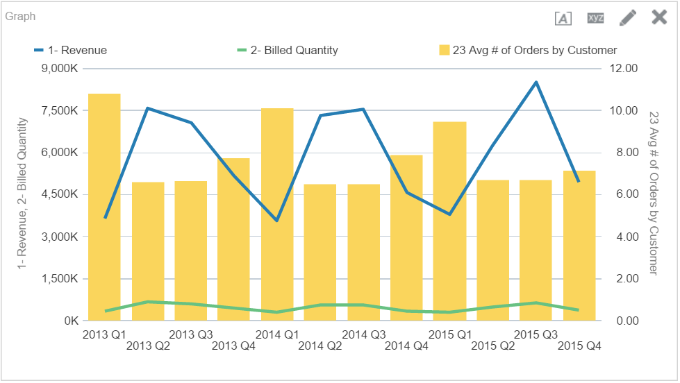
Changing the riserType attribute in the XML by hand change the line or bar visualization
This is already a nicer result and the business users are almost happy with it…
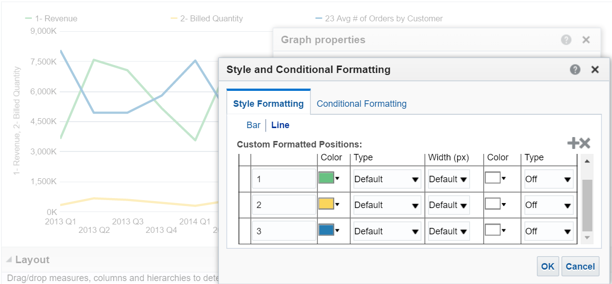
Just one detail: changing the line and bar attribute had a side effect, colours changed as well.
The first chart, the out of the box one, had the right colours: blue for Average number of orders, green for Revenue and yellow for Billed Quantity.
Set colours after changing the XML by hand
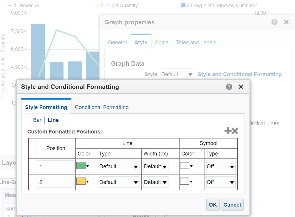
The colors can be defined in the normal way in the graph properties
Setting the colours can be done in the normal way by opening the Graph properties and in the Style tab enter into the Style and Conditional Formatting.
The view editor doesn’t reflect the visualization type but only the left-right axes association
This perfectly works even if in the view editor the GUI still say that Revenue and Billed Quantity are bars and not lines, so the view editor doesn’t reflect the reality of the visualisation set by hand in the XML.
Done! We have the perfect chart asked by the business …. except that the users changed their mind and now want 3 lines still using a dual Y-axes chart.
Dual Y-axes with only lines and custom style
We already saw how to change bars and lines, so setting lines for all the 3 measures isn’t difficult. But how to set a custom style for the 3 lines?
The styles in the graph properties apply by bar or line in the order to all the measures
The visualization engine simply applies the styles defined in the Style and Conditional Formatting based on the visualization type Bar or Line. It doesn’t care about the left or right axis and the original definition of bar or line. It applies the style in the defined order from top to bottom of the measures matching the type (line or bar) as defined in the view editor.
This time we have the perfect output matching the requirements of the business users and we only had to change few attributes in the XML.
To resume, and some advice
- The out of the box Line-Bar chart provide 2 Y-axes
- It’s possible to customize the visualization type, line or bar, for each measure
- It’s not supported by the GUI and need to be done by hand in the XML
- Custom styles work related to type of visualization ignoring the original type and axis
- The changes in the XML aren’t visible in the GUI (visualization editor), so please document them!
- Be aware the syntax and support of this can change with updates / upgrades (actually this tricks works with 11g and 12c)
Also keep in mind that XML has some rules and you can easily make mistakes! So backup your analysis before to play with it …
Cool idea.
I’ll tray it this weekend